Discover how small, strategic changes can transform your website into a lead-generating machine. Learn key fixes for CTAs, speed, trust signals, and more
Saif Abbas
7
min read
Imagine walking into a small shop in Singapore or a crowded market in Jakarta that’s dimly lit, cluttered with random items, and has no one around to help. Even if they had what you needed, you’d probably walk out, right?
Now, think of your website.
A poorly designed website is just like that store—uninviting, confusing, and frustrating. Instead of attracting customers, it silently pushes them away. High bounce rates, low engagement, and lost opportunities are all signs that your website might be scaring away potential leads.
The good news? Fixing it doesn’t require a complete overhaul. Often, small, intentional changes—like simplifying your content, streamlining CTAs, or adding the right emotional triggers—can make all the difference.
So, how do you know if your website is pushing people away? And how can you turn it into a conversion machine? Let’s find out.
What Does a Bad Website Look Like?
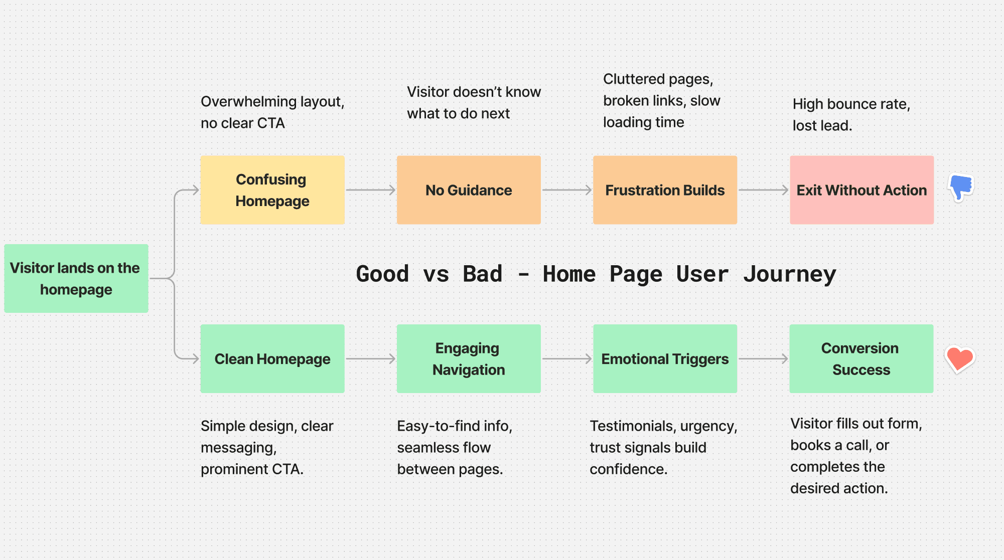
Sometimes, it’s obvious when a website is underperforming—outdated design, broken links, or painfully slow loading times. But in many cases, the red flags are more subtle. Here’s what to watch for:
1. No Clear Next Step
Have you ever landed on a website and thought, “What now?” That’s exactly what your visitors feel when your pages lack a clear call-to-action (CTA).
For example, imagine landing on the homepage of a Singapore-based consulting firm. The site might look decent, but instead of guiding you to 'Schedule a Free Discovery Call' or 'Download Our Case Study,' it bombards you with vague promises and links to blog posts.
The Fix: Every page should have one primary CTA. Whether it’s booking a call, filling out a form, or downloading a resource, the next step should be obvious. Websites with a clear call-to-action on every page increase conversions by up to 47%
Did you know that 44% of clicks generated by B2B companies direct to the homepage instead of a landing page? Unfortunately, homepages aren't targeted enough to drive conversions. So a more logical next step is a dedicated landing page or a page designed to convert them on the spot.
2. Too Slow and Too Complicated
Speed and simplicity are non-negotiable. Today’s visitors won’t wait more than 3 seconds for a page to load, and they don’t want to wade through jargon or cluttered layouts to find what they need.
Think about how Slack’s website works. It’s fast, sleek, and to the point. You immediately see their value proposition—“Slack is your digital HQ”—with a clear button to try it for free.
The Fix: Optimize your site for speed and focus on minimalism. Remove unnecessary design elements and let the content shine.
3. Missing Emotional Triggers
A well-designed website doesn’t just look good—it makes visitors feel something. In Southeast Asia, particularly in Malaysia and Indonesia, trust is built not only through testimonials but also through community connections and endorsements by well-known local figures. Whether it’s urgency from a limited-time offer or trust built this way, these emotional triggers can make or break conversions.
“Urgency and excitement work best when visitors are already solution-aware. A strong offer paired with social proof at the right time can seal the deal.”

Why Some Websites Work (and Yours Might Not)
Have you ever visited a website that just felt... effortless? Everything you needed was right there, and every step made sense. That’s no accident—it’s a result of intentional design.
Here’s what the best websites get right:
Speed and Simplicity: They load quickly and don’t overwhelm with information.
Focused Messaging: They speak directly to the customer’s pain points.
Trust Signals Everywhere: Testimonials, awards, and guarantees are prominently displayed.
Clear Navigation: Visitors always know where to go next.
Contrast that with underperforming websites, which feel cluttered, confusing, and outdated.
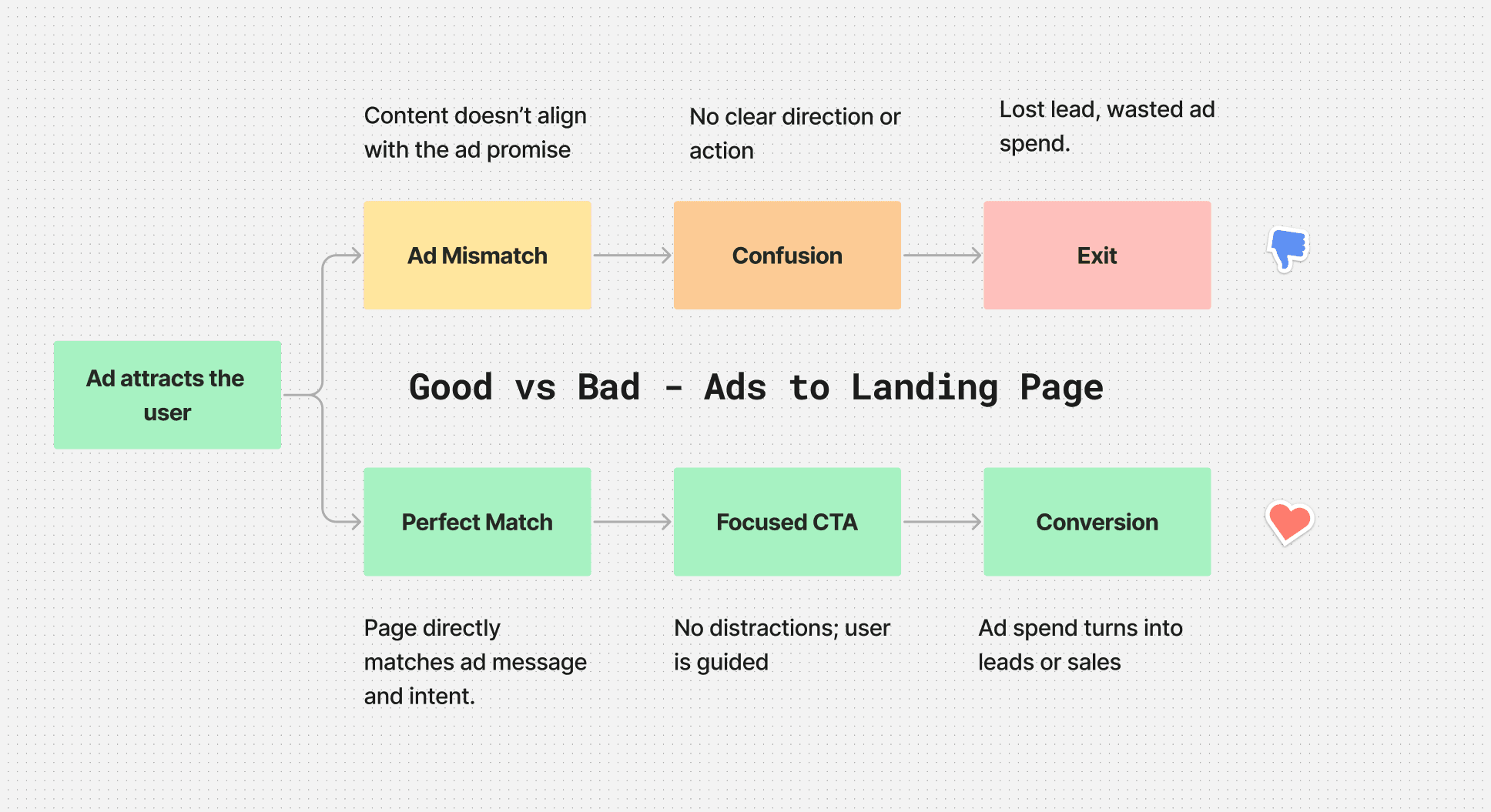
Imagine clicking on an ad promising exactly what you need, only to land on a generic homepage with no clear direction.
That’s what happens with poorly designed websites lacking tailored landing pages. Instead of guiding visitors to take action, you leave them confused, frustrated, and ready to bounce.
The result? Wasted ad spend, low ROAS, and missed opportunities. A tailored landing page, on the other hand, matches the ad’s promise, streamlines the journey, and drives conversions—turning every click into potential revenue.

Why Businesses Hesitate to Improve
It’s surprising how many businesses stick with a website they know isn’t working. Why?
“It’s Good Enough” Syndrome: In SEAN region, many businesses stick with outdated websites due to a 'good enough' mindset or fear of the complexity that comes with updates. Without data to prove otherwise, many assume their site is doing fine.
Complexity Fear: Updating a website can feel overwhelming—time-consuming, expensive, and full of unexpected challenges.
Too Many Stakeholders: Website projects often involve multiple teams, leading to endless debates and decision fatigue.
“Once we show businesses the data—high bounce rates, low engagement—they’re far more willing to take action.”
Quick Fixes to Boost Conversions
Fixing your website doesn’t have to be a months-long project. Here are some simple, high-impact changes you can make right now:
1. Streamline Your CTAs
One page, one goal. Don’t overwhelm visitors with multiple calls-to-action. Make it crystal clear what their next step should be.
2. Make Forms Friction-Free
Stop asking for 10 fields of information. A name, email, and phone number are often all you need to start the conversation. In markets like Indonesia and the Philippines, people are often more comfortable reaching out over messaging apps like WhatsApp. Instead of a long contact form, consider integrating a 'Chat with Us on WhatsApp' button for a quicker, more familiar experience.
3. Build Trust at Every Step
Add testimonials, case studies, and security badges where they count. Visitors should feel reassured, not skeptical.
4. Simplify Your Content
Answer visitors’ key questions immediately. Cut the fluff, use clear language, and guide them to their next step.
Real-Life Results: Turning a Website Around
A B2B SaaS company came to us with a frustrating problem: their website wasn’t converting leads. Despite steady traffic, their bounce rate was over 70%, and inquiry forms were barely being filled.
The Problem:
Their homepage lacked focus and had three conflicting CTAs.
The site loaded too slowly on mobile.
Testimonials were buried at the bottom of the page.
The Fix:
We simplified their homepage messaging and focused on one primary CTA: “Start Your Free Trial.”
Optimized for speed and ensured the mobile experience was seamless.
Moved testimonials to the top of the page to build trust immediately.
The Results:
Bounce rates dropped by 35%.
Form submissions increased by 60%.
Trial sign-ups nearly doubled in the first month.
This website optimization was just the first step. The real impact? Our client booked 890 demo calls in just 12 months. Want to learn more about how we did it? Check out the full case study here.
Why a Professional Assessment Matters
Automated tools can identify surface-level problems, but they miss the bigger picture. In Southeast Asia, where businesses often serve multiple countries with different languages and cultural expectations, a professional assessment can help tailor your website to meet each audience's needs—ensuring no potential leads are lost due to cultural mismatches.
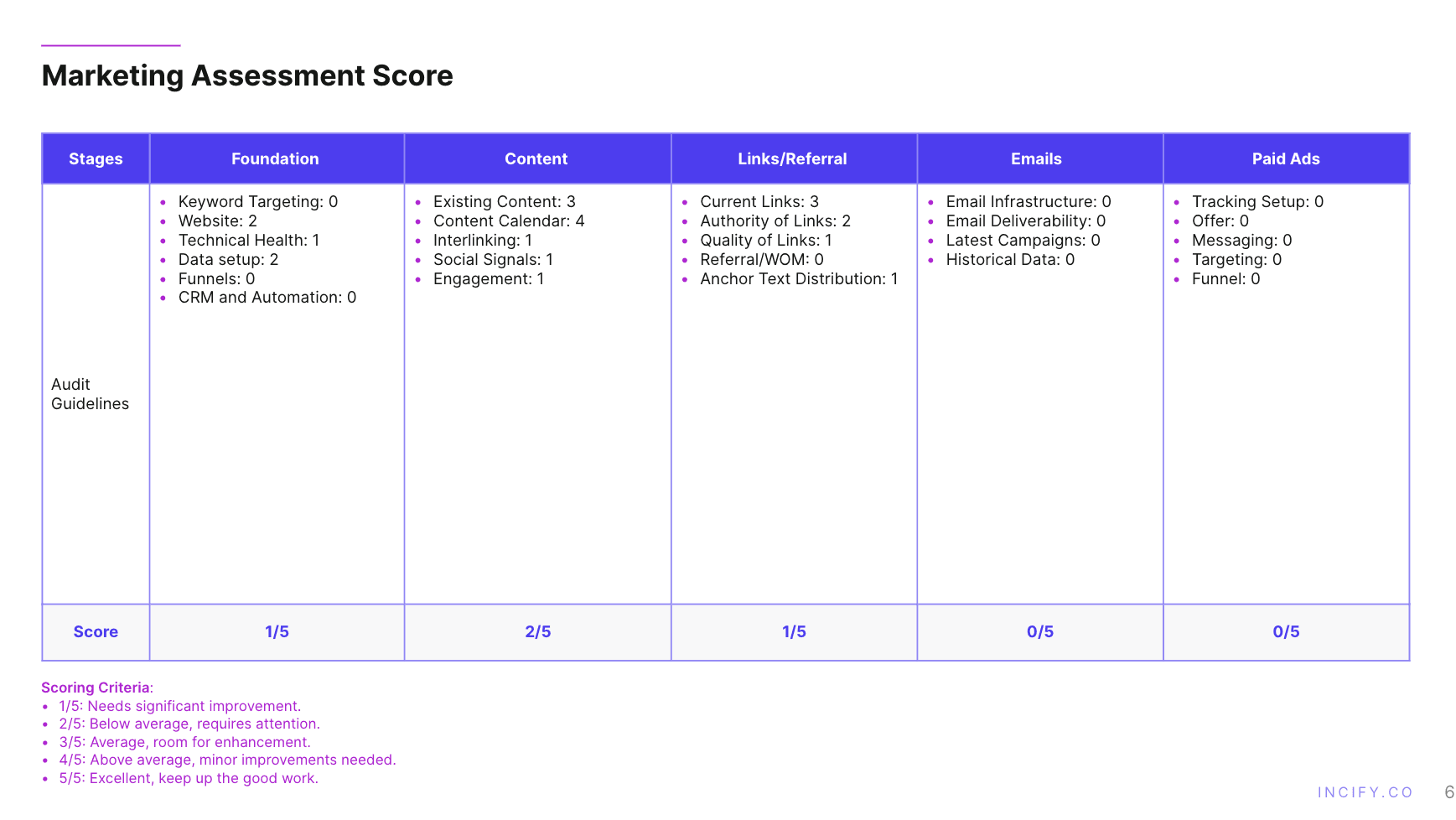
At Incify, our assessments go beyond the website—we look at your entire marketing infrastructure, ensuring every part of your funnel works together to drive results.
“We don’t just audit websites; we provide actionable, transformative insights that turn underperforming sites into revenue engines.”

(This image shows our assessment scorecard covering 5 core stages, with UX/UI and website evaluation as part of the foundation stage).
The Next Step: Take Action Now
Your website should be your strongest sales tool—not a silent sales killer.
At Incify, we’ve helped businesses across Southeast Asia—from Singapore to Malaysia—turn their websites into lead generation engines. With our professional assessment, you’ll get a clear roadmap to fix what’s broken and unlock your site’s full potential.
Ready to stop scaring away customers?
Click below to schedule your free 15-minute discovery call.
Your next customer is just a click away—don’t let them slip through the cracks.
